Showing posts with label perception project. Show all posts

The Perception Project: Day 3


The Perception Project is a series of posts on The Sirenic Codex and Pass the Chiclets with the purpose of demonstrating the differences in perception. As bloggers, we know that everyone has subjective tastes but to what extents? We'll look at that throughout the week. There will be three posts here and three on Eden's blog, and every post will feature a label and a cover we think matches the label (so we're only picking based on the visuals, not the content). We'll write a little about our choices, and you can chime in the comments, or pick your own covers.

The first label is "Happy"


P.E.'s Pick

This was an impossibly hard pick. I never realized how dramatic or depressed the covers for books I read are until I had to pick a happy cover. I went with a book I've never read. I need more happy books. Anyway, there's sun, and there's love, and they're on some cute bridge which seems scenic so I'd consider this a happy cover.


Mari's Pick

This is a tough one, but I think Along for the Ride's cover embodies happy quite well. A bicycle, pretty polka dotted pink dress, sandy beaches and welcome company. This cover just screams happy summer times.


Eden's Pick

It seems like there hasn't been this clean yet fun a YA cover in ages. The blocky lettering, bright colours and paper cut-outs perk me up instantly; the whole cover feels like a well-crafted middle school diorama-type project.


The next label is "Frightening"


Mari's Pick

Is it just me or does she looks like she is being choked by ambiguous manicured hands. This one sends chills down my spine. As a kid I watched a show where there was this murderer and she dressed up with a white sheet over her body and murdered people. This one looks too similar and that creepy face poking out under the sheet. I think I’ve made my case.

Eden's Pick 

Okay, the bullet holes are just plain intimidating. Add in the eerie blue-tinged forest with light creating shadows out of nothing, and this cover does its job selling itself as a thriller.


P.E.'s Pick

This cover is so gross and creepy. It's one of the only covers I try my best not to look at. It has weird, gross eyes even on the spine, end it's so disturbing that a kid in my class turned the cover away from him. I ended up leaving it face down because I'm slightly nauseous looking at it.


P.E.'s thoughts

Eden's pick for happy stands out. I love the colours of that cover, and for me it's just the word "dying" that throws me off a little. In my happy world, there isn't death. I've never seen Mari's Uglies cover before and that is definitely creepy. It fits the novel pretty well too!

Mari's thoughts

I find it interesting how the two of us chose summery, romantic couple covers as happy. All the happy covers also feature daytime and the sun. So bright and in love = happy. As for scary, I agree with all three.

Make sure to check out the second part on Eden's blog, Pass the Chiclets!

The Perception Project: Day 2


The Perception Project is a series of posts on The Sirenic Codex and Pass the Chiclets with the purpose of demonstrating the differences in perception. As bloggers, we know that everyone has subjective tastes but to what extents? We'll look at that throughout the week. There will be three posts here and three on Eden's blog, and every post will feature a label and a cover we think matches the label (so we're only picking based on the visuals, not the content). We'll write a little about our choices, and you can chime in the comments, or pick your own covers.

The first label is "Illustrated"


P.E.'s Pick

Easiest pick ever. No really. This cover is a gorgeous work of art that has so many intricate details and uses its space so well. It's one of my favourite illustrated covers.


Mari's Pick

I love this cover, it's so mystical and fantastical. The dragon and the city below looks amazing. Everything looks pencil drawn and the burgundy red colour around the borders makes it seem old and antique.


Eden's Pick

This category was so difficult to pick for, but I had to go with this one. The illustration style is thick-brushed and exploding with details, and the girl's posture (along with the mummy's!) is captured perfectly. The hand-lettered title's brown goes well on the pale jade background and pink accents.

The next label is "Aquatic"


Mari's Pick

The first thing one notices when looking at this one is the water. It plays such a big role as it’s also in the title. The complimentary blue of her dress and the aquatic flowers support the theme of the cover as well.

Eden's Pick 

So much love for this cover. It's dramatic, but toned down because of the muted colour scheme; the light draws my eye toward the glowing insignia and the shiny golden title, while there's plenty of texture to be found in the background.


P.E.'s Pick

Again, one of my favourite covers. I've always loved how dark this one is. The fact that it's underwater means it fits "aquatic". What's best about this cover is the symbolism. The girl is in dark, murky water and the guy holding her gives a menacing image.

P.E.'s thoughts

Can't say I disagree too much with the choices. I've noticed my choices so far have included dark covers, which says something about my personal tastes. Seraphina for illustrated is a really good choice too. I was also interested to see that we all picked different perspectives for "aquatic". Eden picked an actual picture of water, Mari picked a girl floating above the water, and I picked a girl trapped under water.

Mari's thoughts

I really like all the choices for illustrated. As for aquatic, I find it interesting that all the covers are dark. They feature water but not in a light sense. P.E. and I's have the ominous feeling around them, while Eden's is very dramatic.

Make sure to check out the second part on Eden's blog, Pass the Chiclets!

The Perception Project: Day 1


The Perception Project is a series of posts on The Sirenic Codex and Pass the Chiclets with the purpose of demonstrating the differences in perception. As bloggers, we know that everyone has subjective tastes but to what extents? We'll look at that throughout the week. There will be three posts here and three on Eden's blog, and every post will feature a label and a cover we think matches the label (so we're only picking based on the visuals, not the content). We'll write a little about our choices, and you can chime in the comments, or pick your own covers.

The first label is "Classic"


P.E.'s Pick


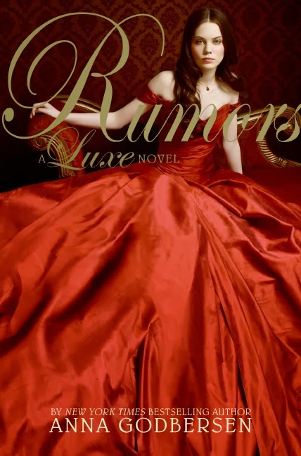
Already, I've run into a bit of a snag. However, I'm pretty happy with my choice. I pick Rumours by Anna Godbersen because of the golden font that reminds me of ages gone by, the stunning dress from another time, and the girl with classically good looks sitting on that super elaborate chair.


Mari's Pick

I strayed to something more subtle but equally beautiful, in my opinion. What I Saw and How I Lied has the period feel going for it. The black and white theme with a dash of colour from her lipstick shows an agelessness that can only be associated with classic.


Eden's Pick

With the blend of deep, rich red and gold, the paper texturing and blocky serif font, this cover feels modern and classic to me at the same time. The silhouette is the perfect teaser of the actual story.


The next label is "Romantic"


Mari's Pick

What is more romantic than a girl and boy innocently holding hands while walking down the shore, watching the sun/moon rise above them and being bathes in beautiful purple light? Moonglass by Jessi Kirby is simple, romantic and sweet.

Eden's Pick 

Tris & Izzie, Mette Ivie Harrison
The beautiful fall colour scheme matches the tranquility of the water shot, and the falling, fluttering leaves add to the atmospheric moment. The posture of the models seems to me as if the photographer's interrupted an intimate moment, which makes it perfect as a romantic cover.

P.E.'s Pick

Of course I'm going with a makeout cover. Duh. This one is in black and white, which I've always thought to be charming, and has splashes of red, the colour of love. There's nobody else on the cover except the couple so it's like they've been completely alone in the world until they met each other... *aww*


P.E.'s thoughts

So far, I think I'm okay with all the choices. I was surprised that all the classic picks had some kind of red on the cover, and Eden's pick, The Scorpio Races surprised me a bit. I expected the romantic covers though- they all featured a couple. 

Mari's thoughts

Interesting that you mentioned the fact that all the classic covers have red on them. Come to think of it, we associate red with many things, love, blood etc., but it's also very classical. It's a colour used throughout history. I was also, surprised by Edith's cover choice, very different from what I would consider classic, but valid nonetheless. As for the romance cover, we all went for the 'couple covers' but curiously they all feature some sort of water; the last one featuring rain. Red and Water, Classic and Romantic?


We hope you enjoyed. Make sure to check out the second part on Eden's blog, Pass the Chiclets!