
The first label is "Classic"
P.E.'s Pick
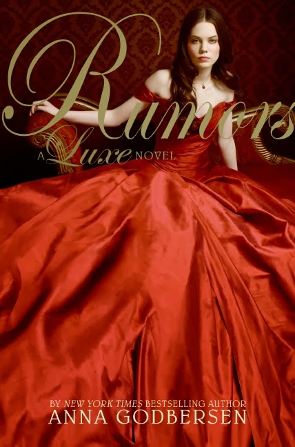
Already, I've run into a bit of a snag. However, I'm pretty happy with my choice. I pick Rumours by Anna Godbersen because of the golden font that reminds me of ages gone by, the stunning dress from another time, and the girl with classically good looks sitting on that super elaborate chair.
Mari's Pick
I strayed to something more subtle but equally beautiful, in my opinion. What I Saw and How I Lied has the period feel going for it. The black and white theme with a dash of colour from her lipstick shows an agelessness that can only be associated with classic.


Eden's Pick
With the blend of deep, rich red and gold, the paper texturing and blocky serif font, this cover feels modern and classic to me at the same time. The silhouette is the perfect teaser of the actual story.


The next label is "Romantic"
Mari's Pick
What is more romantic than a girl and boy innocently holding hands while walking down the shore, watching the sun/moon rise above them and being bathes in beautiful purple light? Moonglass by Jessi Kirby is simple, romantic and sweet.

Eden's Pick
Tris & Izzie, Mette Ivie Harrison
The beautiful fall colour scheme matches the tranquility of the water shot, and the falling, fluttering leaves add to the atmospheric moment. The posture of the models seems to me as if the photographer's interrupted an intimate moment, which makes it perfect as a romantic cover.

P.E.'s Pick
Of course I'm going with a makeout cover. Duh. This one is in black and white, which I've always thought to be charming, and has splashes of red, the colour of love. There's nobody else on the cover except the couple so it's like they've been completely alone in the world until they met each other... *aww*

P.E.'s thoughts
So far, I think I'm okay with all the choices. I was surprised that all the classic picks had some kind of red on the cover, and Eden's pick, The Scorpio Races surprised me a bit. I expected the romantic covers though- they all featured a couple.
Mari's thoughts
Interesting that you mentioned the fact that all the classic covers have red on them. Come to think of it, we associate red with many things, love, blood etc., but it's also very classical. It's a colour used throughout history. I was also, surprised by Edith's cover choice, very different from what I would consider classic, but valid nonetheless. As for the romance cover, we all went for the 'couple covers' but curiously they all feature some sort of water; the last one featuring rain. Red and Water, Classic and Romantic?
We hope you enjoyed. Make sure to check out the second part on Eden's blog, Pass the Chiclets!


Holy goodness, I love your picks for classic! You're right, red is definitely an interesting signifier when it comes to classic--I think especially when paired with gold. And good point, Mari--all the romantic covers featured water. That's very intriguing,
ReplyDeleteTotally. For me, red and gold is classic. Gold especially- I struggled a lot with whether to pick Bright Young Things just because of the classic gold font, but the re of Rumours proved to be too much.
Delete-P.E.
Ahhh...what could be more classical than a girl in a ball gown? And that 20s era cover from Judy Blundel.
ReplyDeleteGreat post, ladies. Thanks for sharing this!
That's exactly my reasoning for Rumours! And I hope you enjoy part 2 & part 3 as well :)
Delete-P.E.
This is a really cool idea. I really thought about starting the Anna Godbersen series, but I didn't because I usually don't go for books like that. I ended up putting the book back. Great post :)
ReplyDeleteJanina @ Synchronized Reading
I know what you mean, both P.E. and I read the books because we loved the covers. They're just too nice to pass up.
Delete-Mari